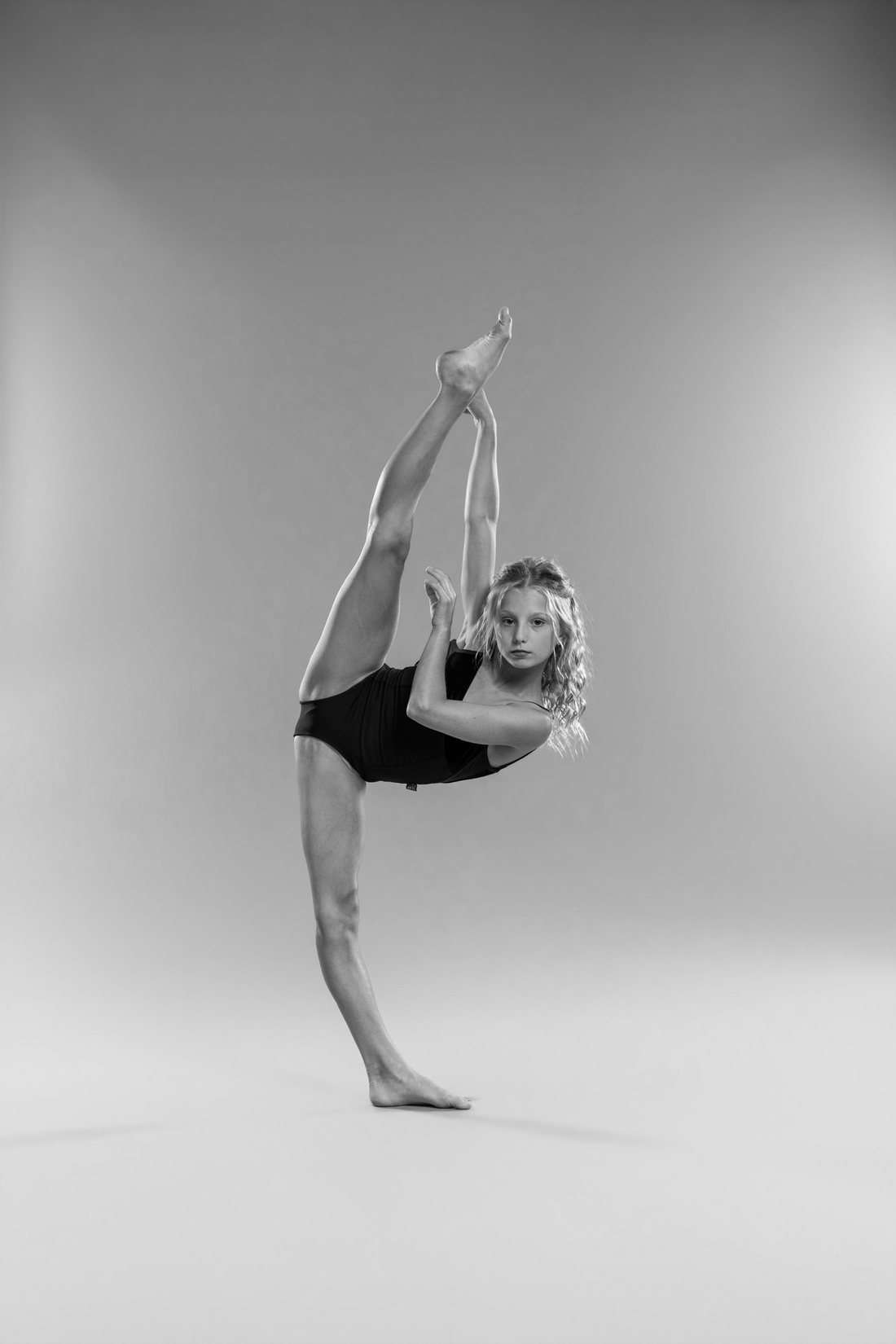
 Option 1 · Photography first
GalleryThe photographs carry the page. Full-bleed black-and-white, minimal chrome, gold used only for action. Closest to a photo book.
Open this design →
Option 1 · Photography first
GalleryThe photographs carry the page. Full-bleed black-and-white, minimal chrome, gold used only for action. Closest to a photo book.
Open this design →
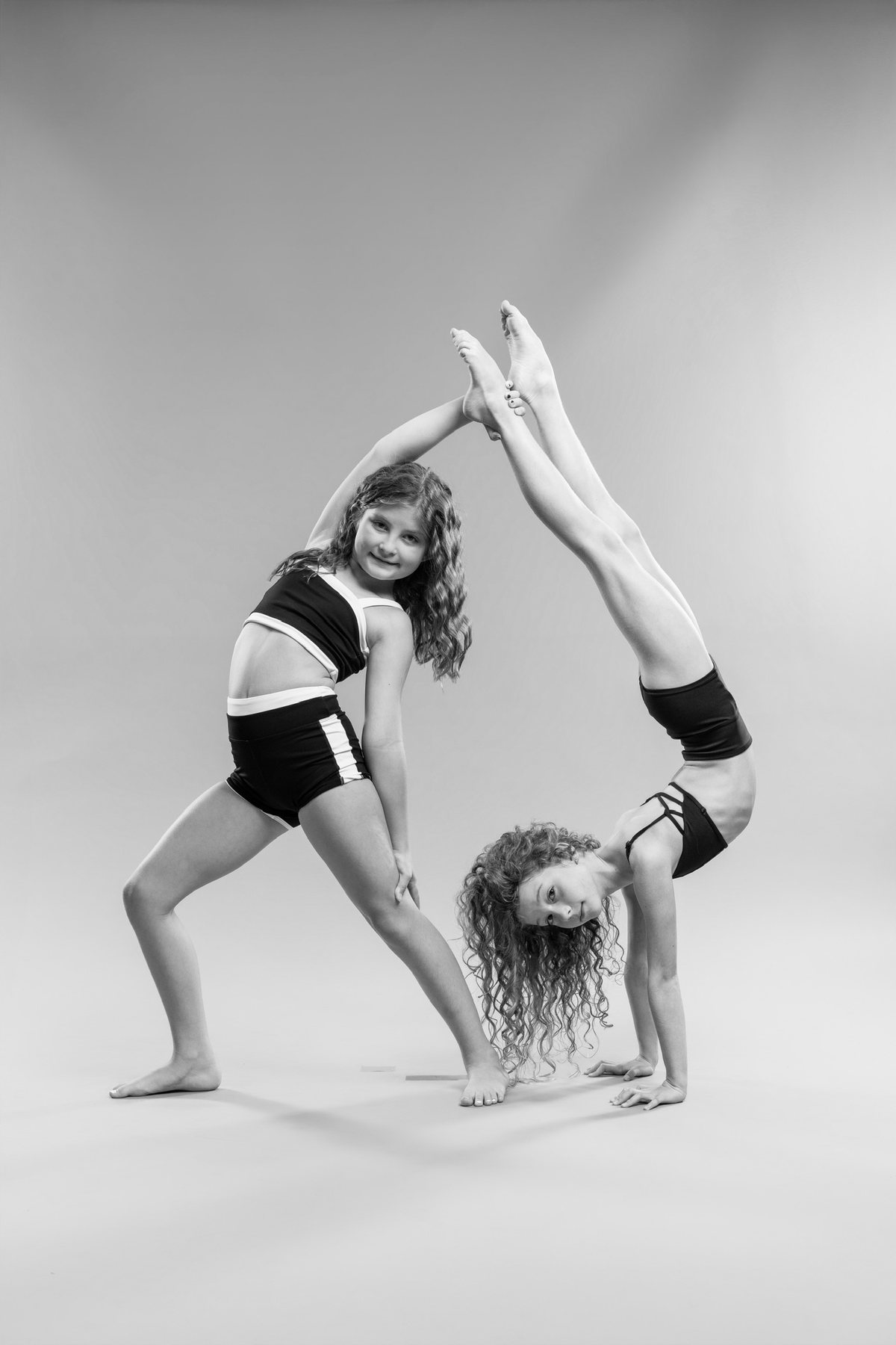 Option 2 · Type first
EditorialMagazine layout. Big display headlines, wide margins, photographs matted like gallery plates with captions. Calm and premium.
Open this design →
Option 2 · Type first
EditorialMagazine layout. Big display headlines, wide margins, photographs matted like gallery plates with captions. Calm and premium.
Open this design →
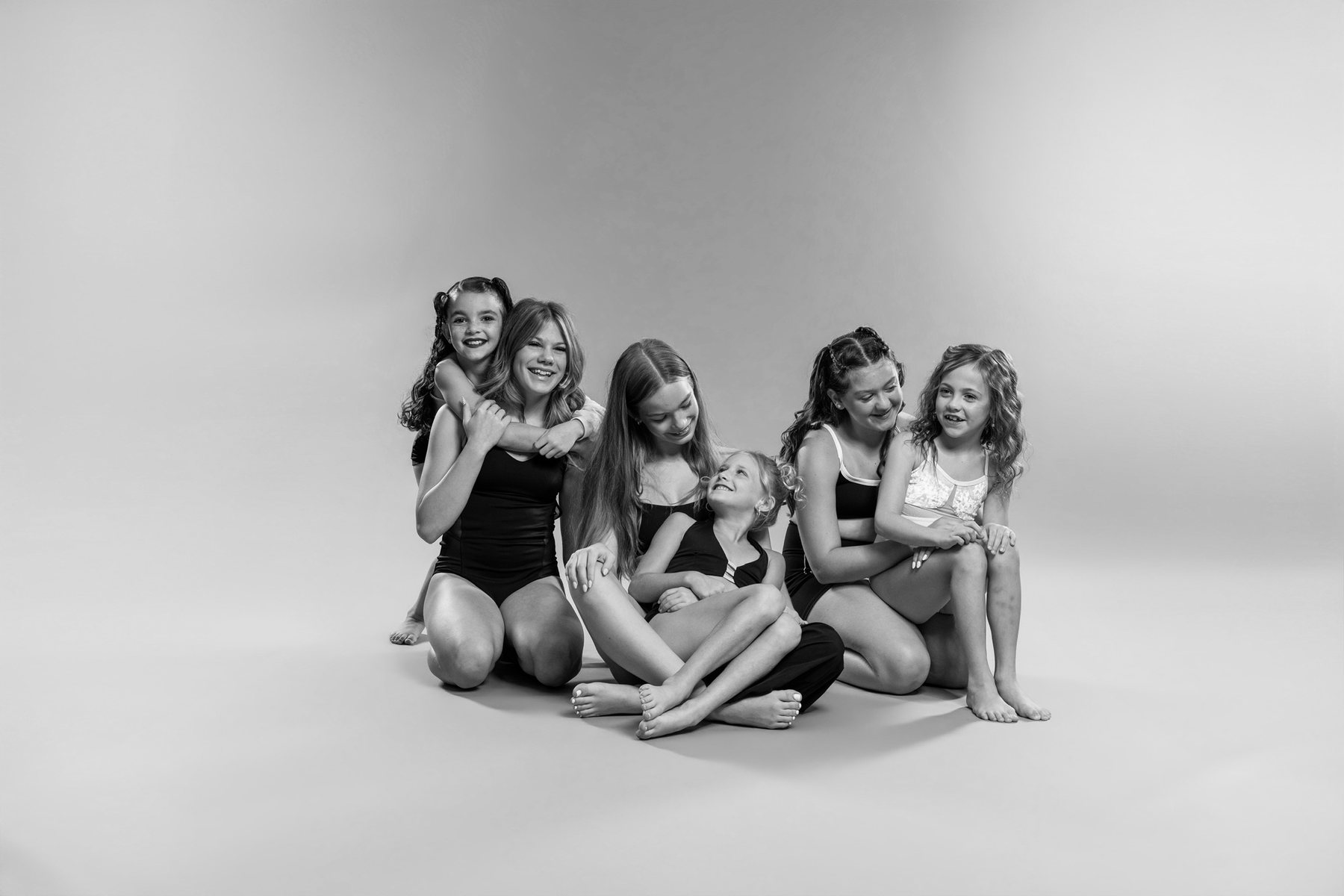 Option 3 · Modular grid
BentoEverything in tiles of different sizes — photo, stat, quote, class, call to action — packed into one asymmetric grid. Dense and scannable.
Open this design →
Option 3 · Modular grid
BentoEverything in tiles of different sizes — photo, stat, quote, class, call to action — packed into one asymmetric grid. Dense and scannable.
Open this design →
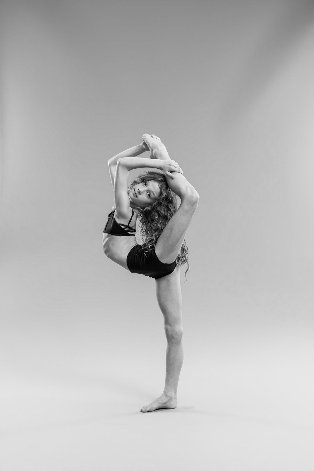 Option 4 · Kinetic
MarqueeCondensed capitals, scrolling text bands and a horizontal filmstrip of photographs. The loudest and most energetic of the seven.
Open this design →
Option 4 · Kinetic
MarqueeCondensed capitals, scrolling text bands and a horizontal filmstrip of photographs. The loudest and most energetic of the seven.
Open this design →
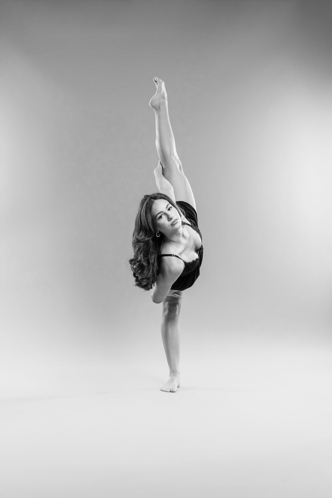 Option 5 · Fixed frame
SplitThe screen is split: photography holds one side while the content scrolls past on the other. Feels like a lookbook.
Open this design →
Option 5 · Fixed frame
SplitThe screen is split: photography holds one side while the content scrolls past on the other. Feels like a lookbook.
Open this design →
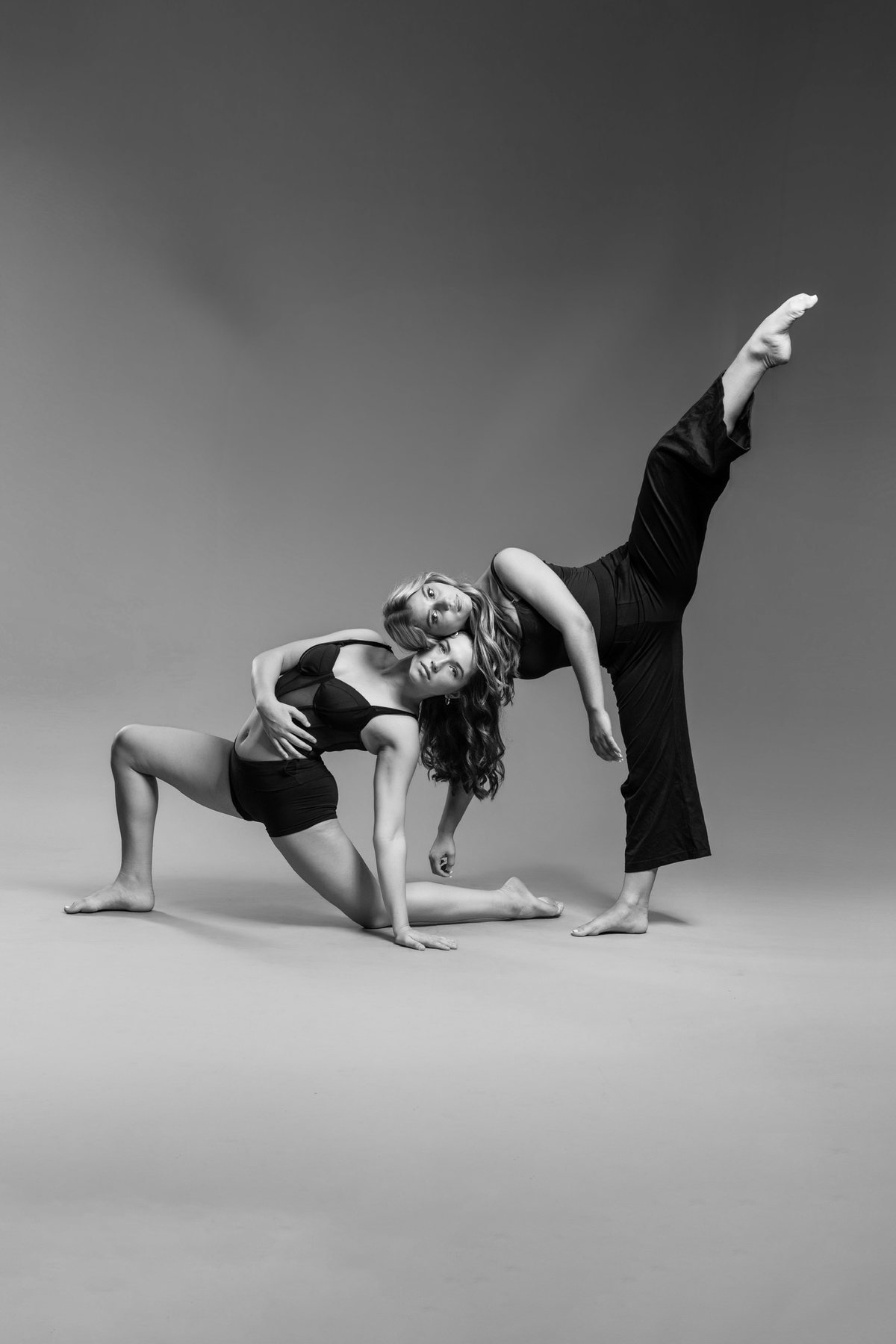 Option 6 · Statement
PosterOne idea per screen at poster scale, numbers pushed forward, photographs used full-bleed between statements. Bold and confident.
Open this design →
Option 6 · Statement
PosterOne idea per screen at poster scale, numbers pushed forward, photographs used full-bleed between statements. Bold and confident.
Open this design →
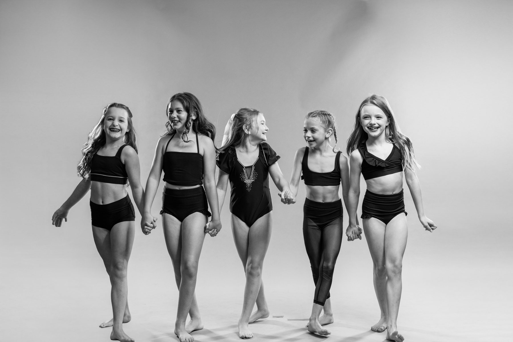 Option 7 · The current build
OriginalThe design already built for Centre Pointe, shown here with the new black-and-white photographs. Centred masthead, a row of quick links under the hero, a scrolling band of styles, and full-bleed photo breaks. The most practical of the seven.
Open this design →
Option 7 · The current build
OriginalThe design already built for Centre Pointe, shown here with the new black-and-white photographs. Centred masthead, a row of quick links under the hero, a scrolling band of styles, and full-bleed photo breaks. The most practical of the seven.
Open this design →